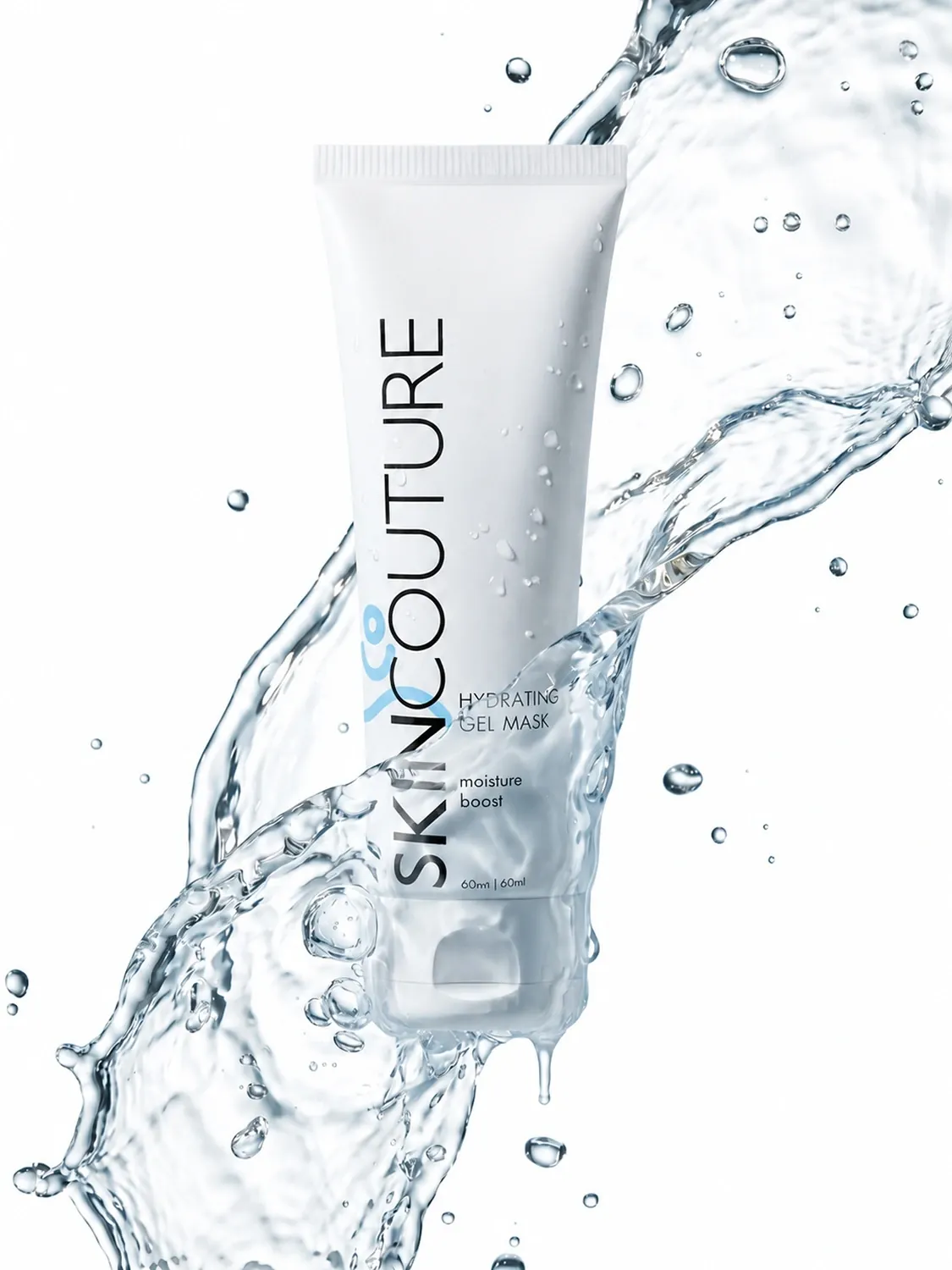
Your main image does its job in search results, not on the product page. It sits in a grid next to a dozen competitors, often at thumbnail size, and it has about a second to make someone tap. Most of what we fix for new clients comes down to five things.
1. One product, one idea
The main image is not the place for every feature. Pick the one thing a shopper must get — "this mask hydrates", "this set is a gift" — and build the frame around it. In our gel mask shot the water splash does that job without a word of copy.
2. Readable at thumbnail size
Shrink the image to 200 px wide before you approve it. If the product turns into a grey blob, crop tighter or add contrast between the product and the background.
3. Light that shows the material
- Glass and liquids need edge light, or they disappear.
- Fabric needs soft side light to show texture.
- Metal needs a gradient to reflect, not a flat white wall.
Flat front light makes almost anything look cheaper than it is.
4. Platform rules first
Amazon wants a pure white background for the main image; Etsy and Shopify are happy with lifestyle scenes. Check the current requirements before the shoot, not after: a reshoot costs more than a checklist.
5. One look across the set
The main image sets expectations for the six or seven images after it. Keep the light direction, color temperature and camera height the same, so the listing feels like one product and not a collage.
A good main image doesn't explain the product. It makes people want the explanation.
Want a second opinion on a listing? Send us the link and we'll tell you what to change first.