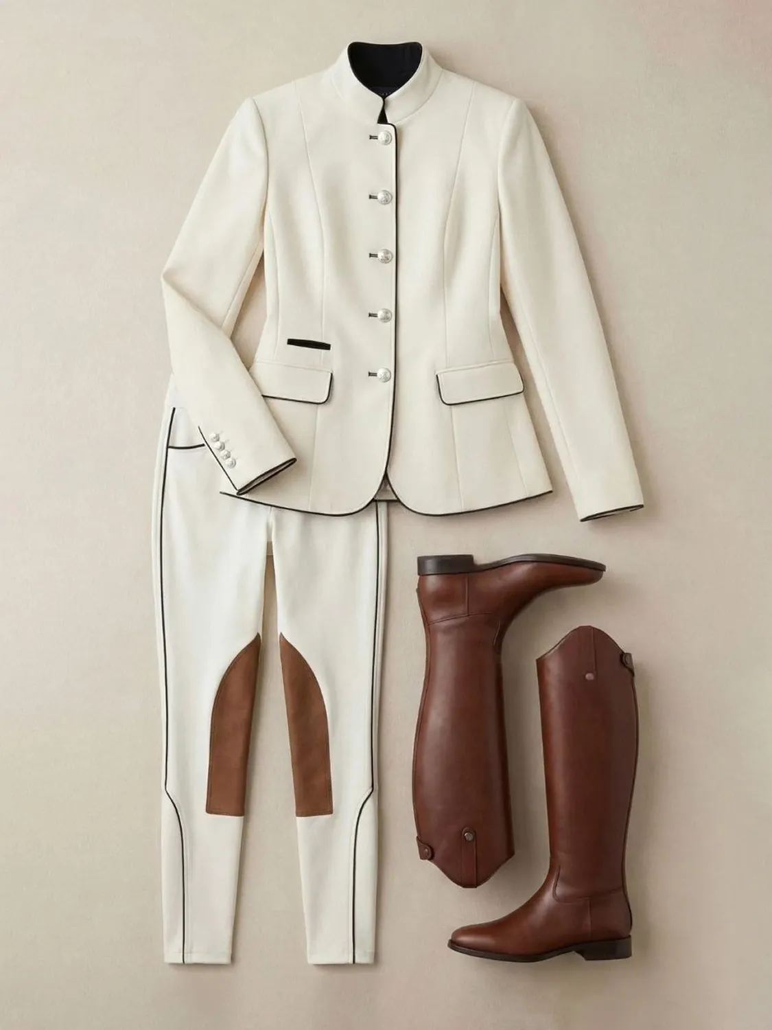
A shopper might find you on Google Maps, check your Instagram and buy in your Shopify store, all in ten minutes. If each place looks like a different shop, some of that trust leaks away. A small visual system fixes it.
Pick a background and stick to it
Choose one or two background tones and use them everywhere: product pages, feed posts, the cover of your business profile. Our flat lay for a riding apparel store uses a warm beige that now runs through the whole brand.
Plan the crops once
- Shopify product images: square, about 2048 px.
- Instagram feed: 4:5, 1080 × 1350.
- Stories and Reels covers: 9:16, 1080 × 1920.
- Google Business Profile: a wide cover and a square logo.
Shoot or render with these in mind and leave room around the product, so one image can be cropped for every channel.
Keep the same light
Color temperature is the quiet part of a brand. Warm and soft, or cool and crisp — choose one and ask every photographer and designer to match it.
Reuse, don't repeat
One hero image can become a product page photo, a feed post, a story background and a profile cover. It's the same picture in four crops, and it saves both money and attention.
A visual system doesn't need a 60-page brand book. A background, a crop sheet and a light reference on one page are enough to start.